

Brooks' Garden: The Brooks Brothers SS27 Collection


In these fleeting days of summer the sun is beaming its brightest and everyone and their mom is scrambling to find a way to bask in it. Meanwhile, Brooks Brothers is putting the sun to use by debuting their Spring/Summer 27 collection right where everyone wants to be. This NYFW is the first for creative director Michael Bastian and designer Jack Wooster under the Brooks Brothers brand. After an 8 year hiatus from NYFW Brooks is back in the limelight, releasing a collection so full of life it birthed a new era.
This presentation by Brooks Brothers was literally a breath of fresh air. The event was held at Radio Park on Rockefeller Center. You step out to a beautiful lawn and you're greeted with a vast landscape with models wearing the collection. I don't care to belabor the point of a garden being the stage, I just find it impressive (and immersive) when brands use the elements to compliment the collection they've put forward. And as someone who hadn't had any contact with Brooks Brothers prior to the presentation, this was a hell of a first impression.

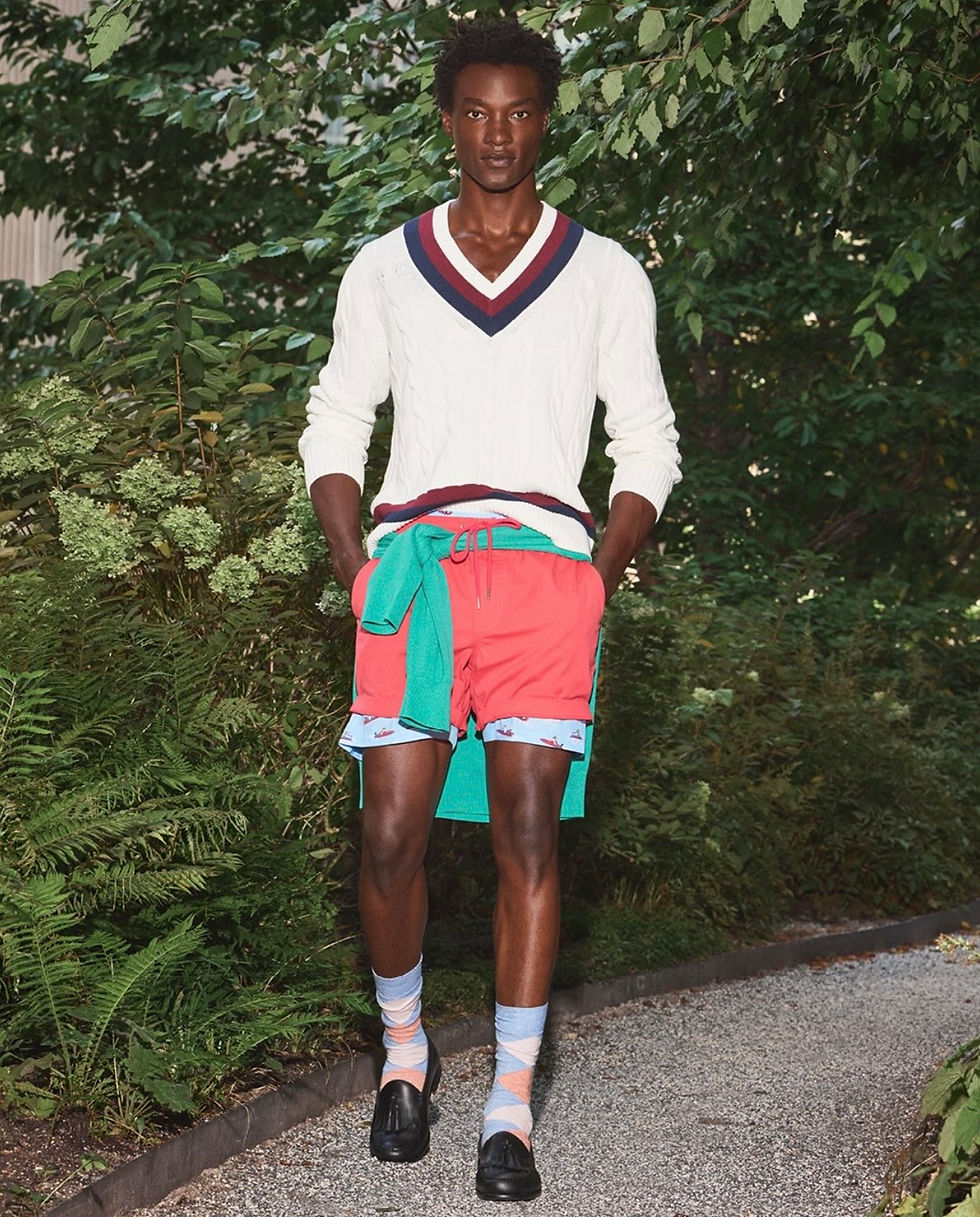
The core of the collection seems to draw from prep in the mid 80s. The use of color and the whimsical designs can't be understated. I feel like it resurfaces a type of style that is extroduanrily unique to that era between '84-'87. Enlarged logos, critter print, and vibrantly colored rugbies & sweaters. Moreover, the cozy silhouettes double down on the authenticity of the design and the period. I would dare to say it's nostalgia materialized, you get all the fun of the '80s aesthetics, sans Reaganomics.
When speaking to another attendee named Rob (shoutout to Rob) as we gazed upon the models matching perfectly with the environment; we got hung up on the discipline it takes in design and color matching to make a radiant, yet congruent collection. I remember saying "this is like an explosion of color with discipline." So often brands will play around with underutilized or oversaturated colors and the final product comes out looking like a school project. Michael perfectly executed the use of colors that are typically associated with maximalism and neutralized them. Another highlight that pushed the lines of what Brooks Brothers typically produces are the contributions from designer Jack Wooster.

It's hard to miss the influence recent collaborator Jack Wooster has all over this collection. He assisted in reimagining classic Brooks looks with his unique artistic point of view, but without a doubt the most daring of alterations were performed on the logo. The alternative logo is a play on the merge of Jack's personal brand and the classic Brooks logo. Featured is a doberman from Jack's logo seen biting the Brooks ribbon (worn in the photo above), when asked about the inspiration he's quoted saying "The dog biting the ribbon kind of summarizes the collab. I'm just here to stir things up." I personally think the design choice is interesting and subtle enough to avoid the stamp of "doing too much" we've all run into the theme in fashion when people try to sloppily decontextualize traditional garments with thoughtless execution. A perfect example of this being the paint splatter technique. I mean really? We're just gonna slap paint on a pair of jeans and call it a day? Anyway, that's besides the point. Jack's input has mixed the pot seamlessly, all the while complimenting Brooks Brothers ode to the '80s with an oasis of color.

Weird as it may be, this look speaks to me. This might've been the most pleasantly confusing piece I saw all fashion week. The (and someone correct me if I'm wrong) resort wear section of this collection has a considerably different energy and focus for the brand. While the aformentioned core of the collection focuses more on color, the resort wear hones in on form and fluidity. Pastel pinks are exchanged for warm browns and skirts move aside for a business formal pant. A more consistently traditional Brooks Brothers approach is found here, but as you can tell from the photo above, they're undoubtably trying new things. There's a slight diversion from what we've come to expect from Brooks Brothers. The womenswear in this part of the collection is more luxury than prep. The designs aren't necessarily serious, I think a more apt description would be a stern elegance. Everywhere I look in this collection I see a brand that just got done stretching and is more than prepared to play in the game.

Lately I've been talking with friends about brands hosting events during NYFW with intention. Hosting an event just to say you did it is such a waste of time and energy in my opinion. You have to do something unique to leave a long lasting impression, and I feel like Brooks Brothers did a great job at conceptually centering their clothes in an environment that compliments their collection. NYFW is full of companies big and small fighting for eyes and cultural relevance. EVERYTHING is branding, and the way you exist will affect the vibes associated with your brand. I think Brooks Brothers was cognizant of that fact and knocked it out the park at their first at bat this decade.
After an 8 year hiatus from NYFW I have to give Brooks Brothers their flowers. There are plenty of people in my generation who have a light understanding of the powerhouse Brooks Brothers is historically in both prep/ivy and the fashion world as a whole. With over 200 years of history, they've been around longer than both Louis Vuitton and Hermès. Brooks Brothers has exhibited generations of mostly competent designers and creative directors that have moved the company forward through, World Wars, Great Depressions, and a Trump Presidency. The Spring/Summer 27 collection isn't a pivot nor a pander, I think they're following a feeling and I'm excited to see where it takes the brand.
Favorite looks from the show:




Comments